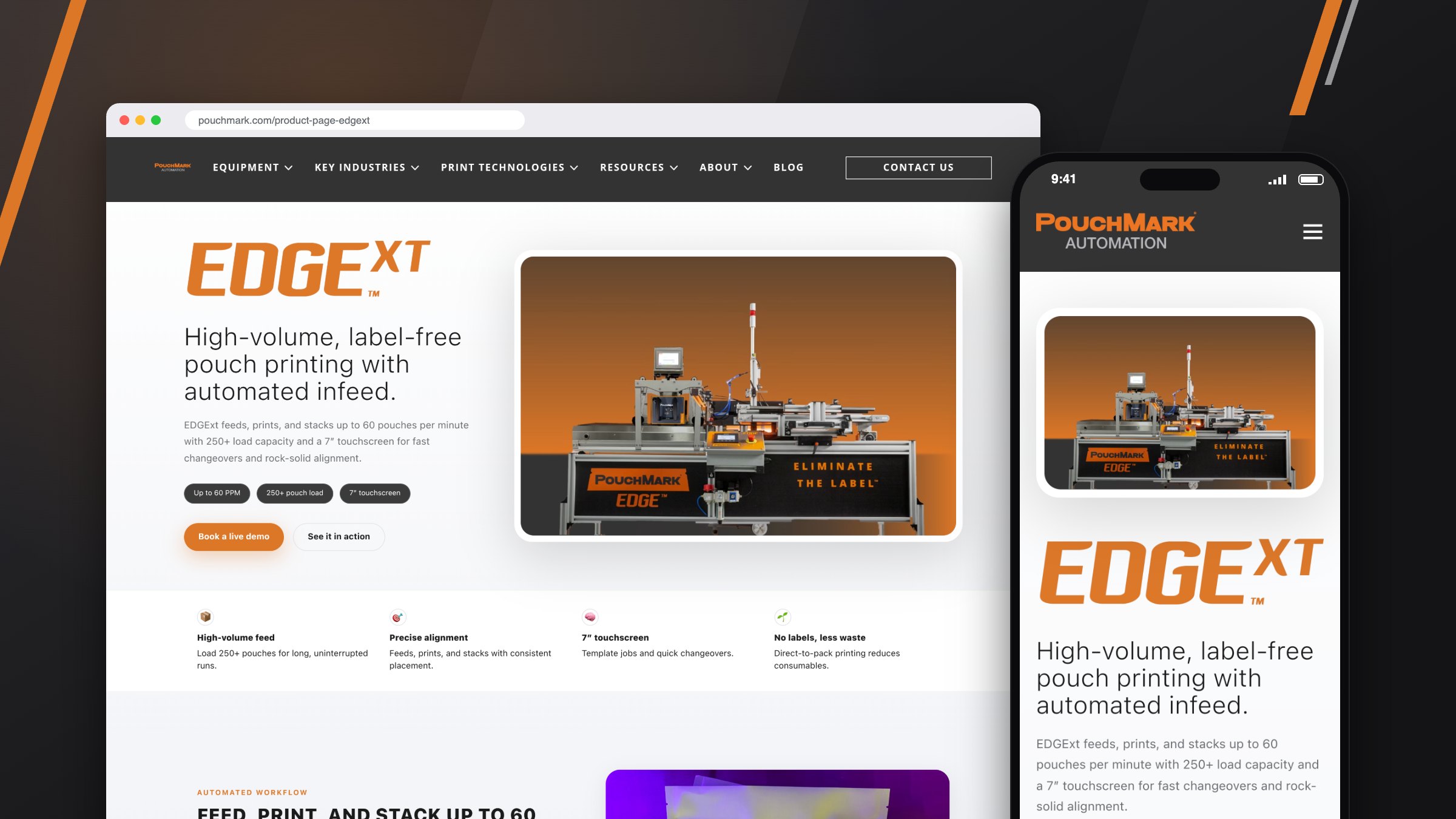
Engineered for precision, designed for simplicity
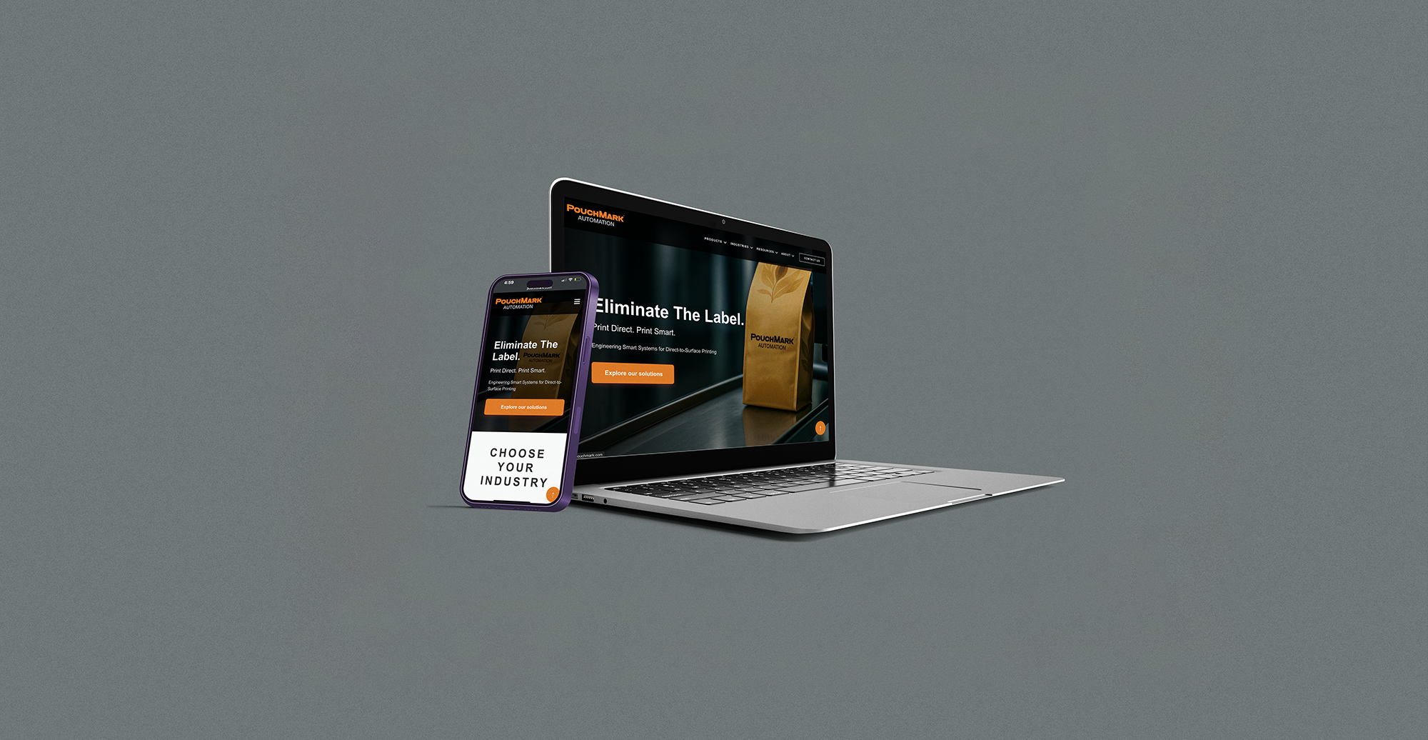
A responsive redesign for PouchMark Automation
I led the redesign of PouchMark's website to align with their refreshed brand identity. The focus was on making complex industrial equipment easier to understand through improved readability, card-based layouts, and a high-contrast design that works better for accessibility.
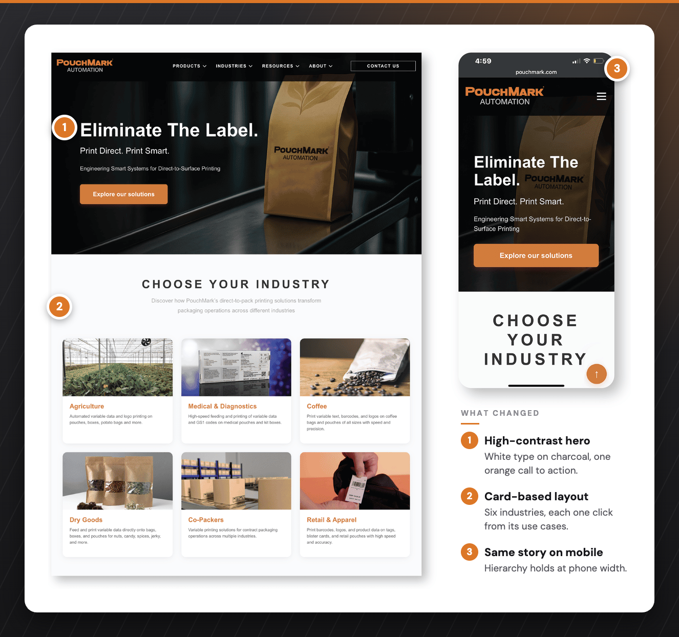
I talked with sales teams, packaging engineers, and procurement managers to understand how people actually make decisions when buying this kind of equipment. One thing became clear pretty quickly: technical buyers need to validate specs fast before they'll invest time going deeper. That insight shaped everything. We put the critical technical info up front while keeping clear paths to more detail and contact options.
Technical buyers need to validate specs fast before they’ll invest time going deeper.
I built the interface for instant clarity using clean card hierarchy, strong contrast, and predictable spacing so users can move quickly and confidently. The layout reduces cognitive effort during navigation and scrolling. The end goal is for the user to be interested in a system and want to fill out the contact form, therefore every branch of the structure has an endpoint at contact.
The design system is built on a tight typography scale, high contrast, and structured spacing. Color and elevation reinforce hierarchy and give tactile feedback. The goal was to create something that feels reliable and easy to navigate, a system you can learn once and apply everywhere.

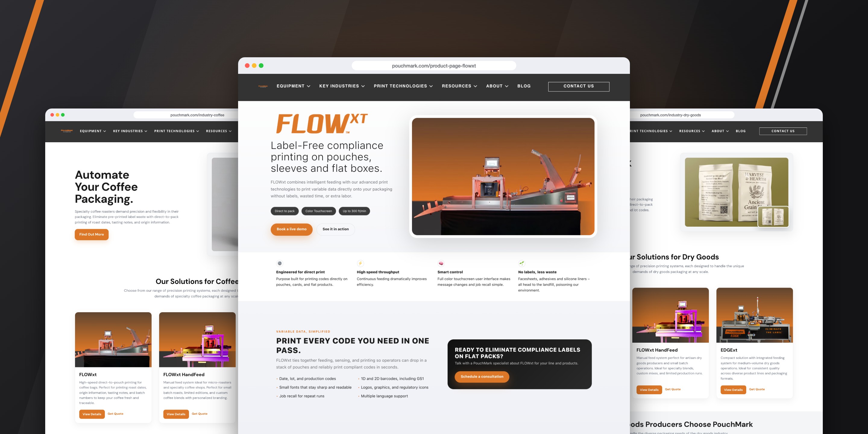
The site needed to present cutting-edge automation without overwhelming people. I used clean layouts, readable type, and subtle motion cues to tell a clear story about complex equipment. It's meant to feel expert but approachable, the kind of interface that builds trust through simplicity rather than trying to impress with complexity.

Rather than organizing products by technical specs alone, I structured the architecture around customer workflows and decision paths. Each product page surfaces the information buyers told me they need first (capacity, speed, footprint), then progressively reveals more technical depth. This lets different stakeholders (engineers vs. procurement vs. executives) get what they need without wading through irrelevant details.
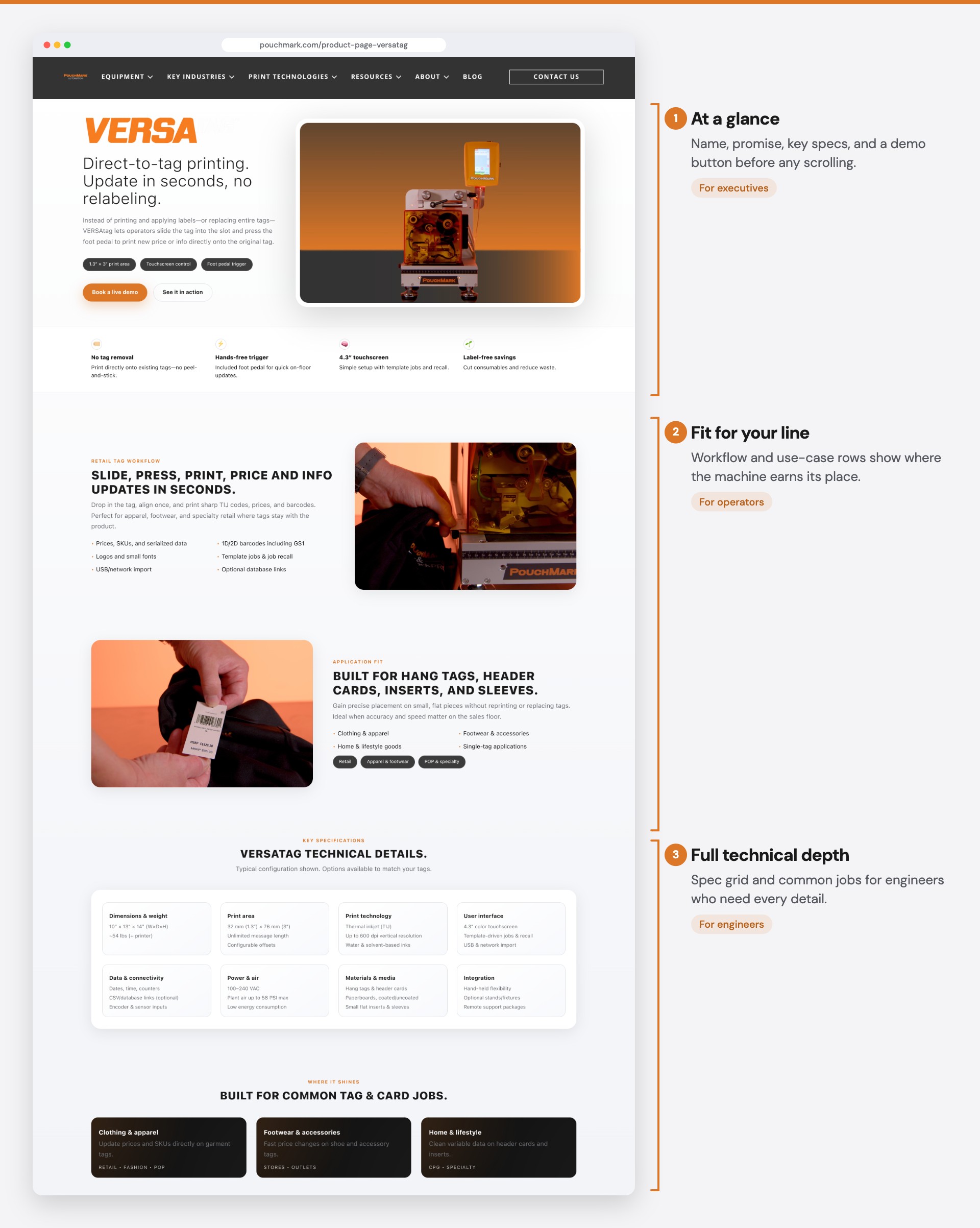
Each product page emphasizes clarity, technical confidence, and conversion readiness. High-fidelity system photography, equipment breakdowns, key capabilities, and direct CTAs help users quickly understand machine value. Structural spacing, bold system headlines, and integrated request-quote buttons support high-intent decision-makers like plant managers and operations directors.
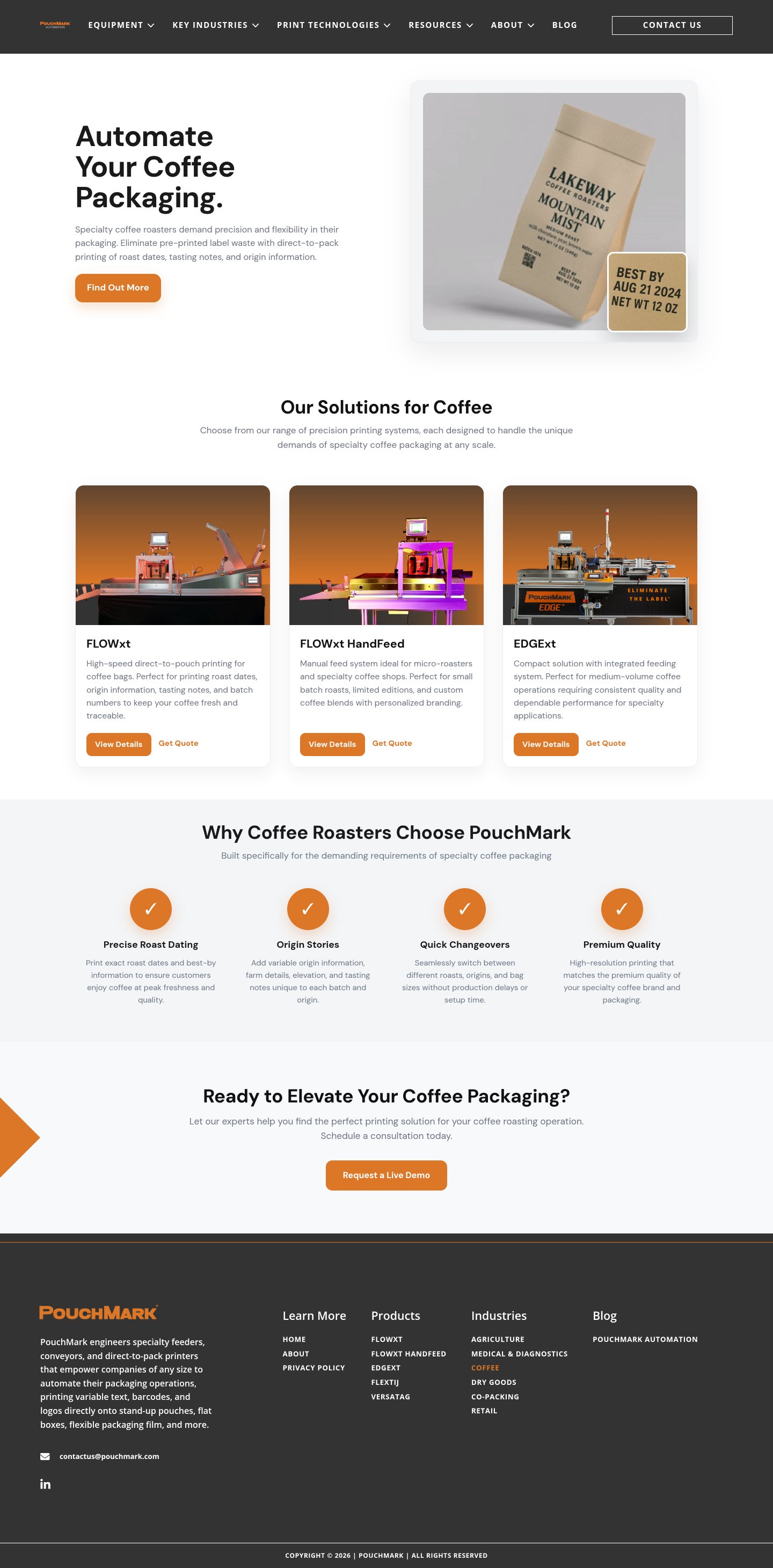

In a niche manufacturing industry, "direct-to-pack printing" is nearly impossible to explain with words alone. I created AI-generated animations that show the completed process. The pouch feeds in, variable data prints on the surface, product exits ready to ship. This visual approach transformed abstract technical capability into immediate comprehension, letting buyers see precision and flexibility before requesting specs or demos.
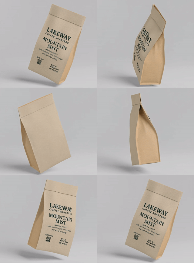

- 01Pouch feeds in
- 02Variable data prints on the surface
- 03Product exits ready to ship
Each product page prioritizes immediate decision factors (speed, capacity, footprint) before progressively revealing technical depth. Rather than forcing all users through the same information hierarchy, the architecture serves executives (ROI and fit), engineers (specs and integration), and operators (workflow and ease-of-use) simultaneously. Industry-specific applications and video demonstrations establish context before specifications appear, ensuring buyers understand value before validating compatibility.
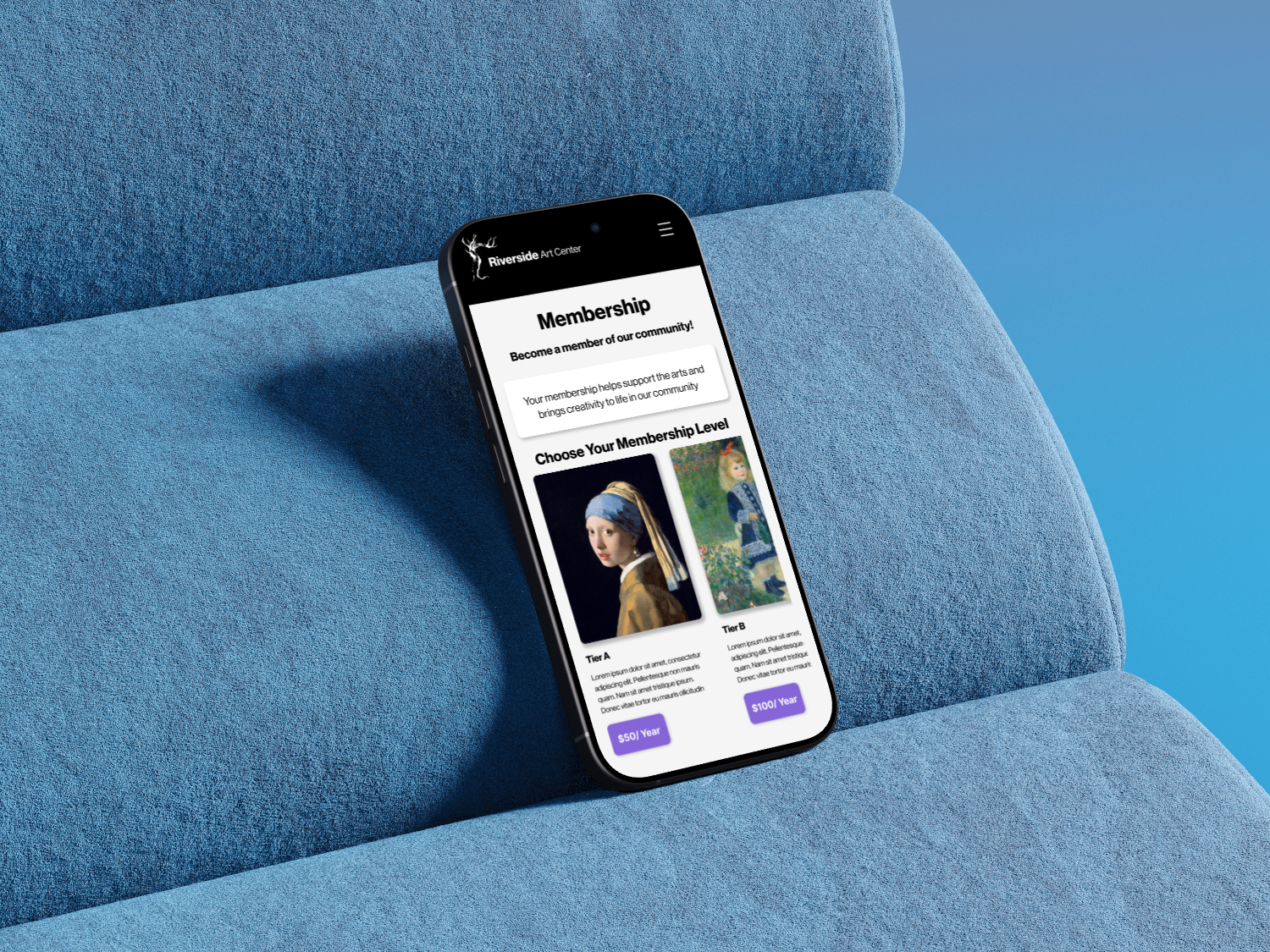
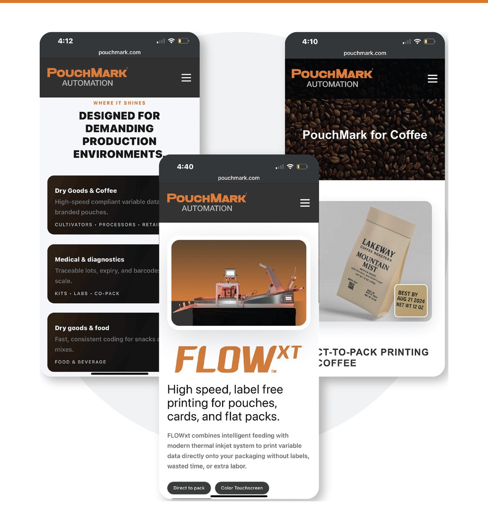
Mobile accounts for the majority of PouchMark traffic, so the responsive architecture prioritizes thumb-driven navigation and quick comprehension. Spec grids collapse to single-column cards, hero images stack above copy, and persistent CTAs remain accessible without viewport clutter. Each section functions as a discrete scroll stop with clear hierarchy, letting users dive deep or skip ahead. Escape routes to contact forms stay fixed at natural pause points, respecting that mobile users research in shorter, interrupted sessions.
- 01Cards collapse to a single column
- 02Each section is its own scroll stop
- 03A clear path to contact at every pause